Honey Creek Meadows
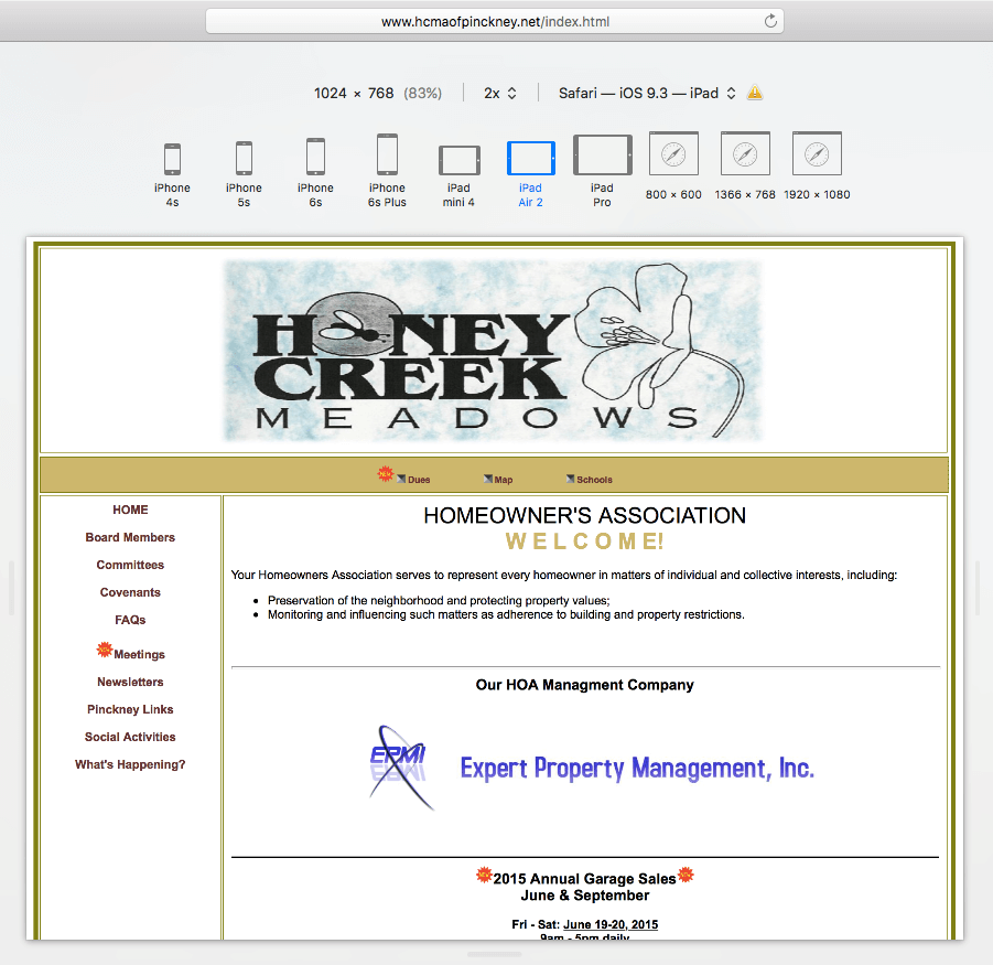
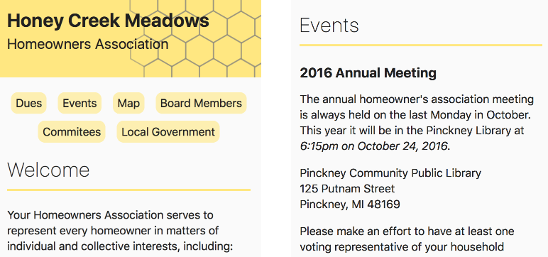
Wed, Sep 28, 2016Honey Creek Meadows is a small homeowners association in Pinckney, Michigan. Their original website was from the table layout era, so I’m trying to build a responsive, accessible update.
New Honey Creek Development Site | Project Github Repository
The website is ultimately not visited very often (I, as a resident in the neighborhood, didn’t realize it existed for years.) It’s an informational bulletin board, so I thought this would be a good opportunity to work on a few ideas that are unfortunately not the highest of priorities on many websites. Throughout the project I wanted to focus on accessibility and readability.
Readability
At least in theory, the default system font within an operating system or web browser is designed for optimal readability. A project that values an easy to read website above brand identity seemed like an ideal situation to see what can be done within the default system UI font-family.
Marcin Wichary’s writing about different approaches to using the default system font on a website convinced me that this could work for the project. Here is the method Marcin supported:
body {
   font-family: -apple-system, BlinkMacSystemFont, "Segoe UI", "Roboto", "Oxygen", "Ubuntu", "Cantarell", "Fira Sans", "Droid Sans", "Helvetica Neue", sans-serif;
}
The shortcomings of this method (like needing to update this list when an OS changes the system font or “Roboto” appearing on an Ubuntu machine where it’s installed) aren’t serious problems for a really small website that is primarily informational.
Choosing to use the system font alone is a little limiting, but for a small project like this there is still plenty of available variety within the font family to create the desired hierarchy. Page titles can be thick and chunky, section titles can be tall and skinny, and body copy can still fit comfortably in between.
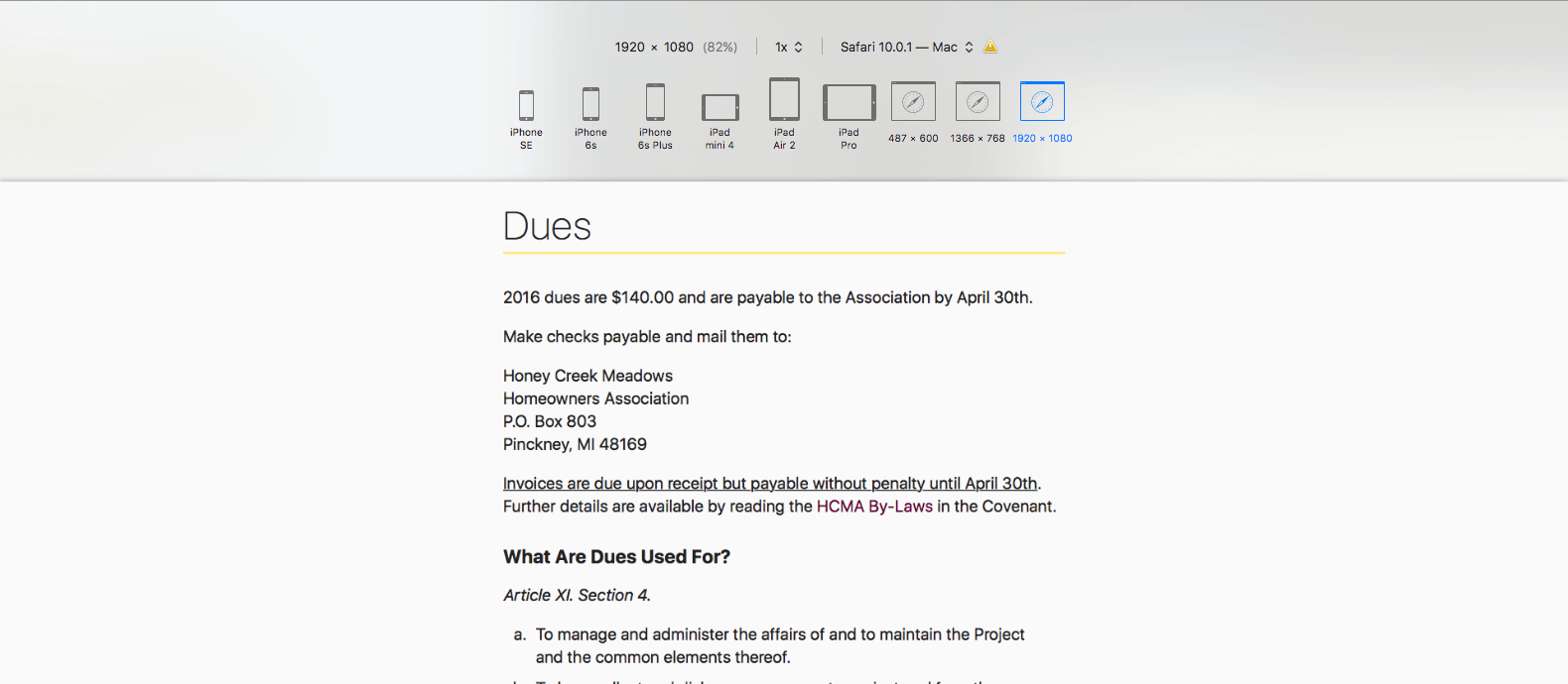
The Honey Creek Meadows site is primarily text and often paragraphs of it. At ever greater screen/viewport sizes it was important to limit the line length of body text. I choose to raise the default font size larger than I typically would to keep the line length comfortably readable.
Accessibility
The impetus that started this redesign was a desire to move away from the original site’s table layout. Using HTML accessible elements and a single page structure with sections for content that used to be individual pages made it both more accessible to screen readers and simpler overall.
Although I discovered HTML5Accessibility.com late in the development of the site, it’s an incredibly helpful resource. Prior to learning about this website, Mozilla’s dev page had been my go to reference.
A color pallet with sufficient contrast must always be considered. Yellow can often be a challenge, but it fit the honey theme so well. As a result, yellow distinguishes between different sections or components of the site. Underlines, navigation elements, or board member cards get a flourish of yellow. The thought being, spacing provides a similar signal in the event yellow doesn’t have enough contrast for some viewers.


